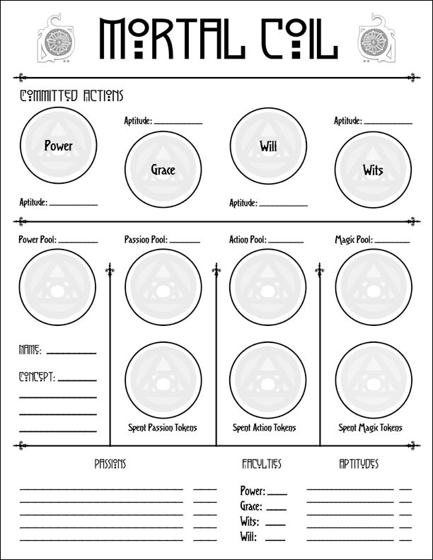
Mortal Coil Character Sheet
Another preview:

To add some explication: A lot of the business of playing Mortal Coil focuses on moving your tokens around, and so the character sheet has a big graphical and layout emphasis on those things (with all the little circles to store your tokens in). The bottom of the sheet has all of the "written down" stuff, which you refer to when the tokens are moved and assigned.
I like what Jenn did with the sheet, it is attractive but not busy, and holds all of the important info.
Labels: mortal coil

4 Comments:
Well done. Is there a reason for the asymmetry in the first section and the presence of header text "Committed Actions" for that section, where other sections are essential symmetric and lack header text? I'm not familiar with Mortal Coil, but I'm very interested in graphic design for games.
Mark,
As I mention in the post, Mortal Coil uses tokens, and moving them around on the sheet is part of play. When you are in a conflict and you want your character to act, you move tokens from your action pool up into the four circles in committed actions. Each of these corresponds with a stat (faculty).
This area has a title because it will be the most heavily used area during play. The bottom portion holds more permanent information and things that won't be moved around quite as much. Basically, the resources you use for actions are stored on the bottom half of the sheet.
The asymetrical layout is for visual interest and to be easier on the eye while in use. The bottom portion is symetrical mostly to fit everything in.
I also want to add that I created a basic layout and provided it to Jennifer, and she created the final sheet. It differs considerably from my original conception, but I like her layout a great deal. She is an artist, so has a good eye for making the sheet attractive. I moved a couple of things around after, but mostly from a standpoint of utility (some lines were too short). It was definitely a collaboritive effort.
Thanks for the thoughtful reply to my comment, Brennan. There's a design principle in there that I ought to nod to in my occasional series on sheet design "Put the stuff that changes frequently somewhat apart from the stuff that doesn't..."
I thought of something similar for Cranium Rats's sheet, that and Stars of David.
Post a Comment
<< Home